| 2002 | 2003 | 2004 | 2005 | 2006 | 2007 | 2008 | 2009 | 2010 | 2011 | 2012 | 2013 | 2014 | 2015 | 2016 | 2017 | 2018 |
BEST PRODUCTION
The Finalists
|
Game Information
|
Designer Feedback
|
|
Excellent use of the medium. Clean structure, all hyperlinked throughout. |
|
|
Simply a gorgeous book. Beautiful, but still readable. Lovely design work in this book, not the least of which is the cover. Unbelievable production values for an indie game. High quality hard cover with great design, full color page illustrations and two-color text. |
|
|
Simple. Good. Simply Good Design, that's what you see when opening this book. From the striking understatement of the cover, to the clear and well readable text layout, to the most fitting page numbering ever, to the incredible character sheet - it's true what the ads say: The apocalypse never looked better! The layout is simple, wonderful and captures of the spirit of the game. Very important in a game without any real artwork. The slick layout delivers the feel that's neccessary to make the game go. |
|
|
I'll admit it - this game turns me on. Unlike the lascivious art
that's |
|
|
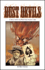
This game packs the goods, and it's real purty to look at too. Simply superb craftmanship! It's worth the money for that alone. Cover to cover the game exudes the Wild West. You can practically feel the dry gritty wind as a lonely tumbleweed crosses a deserted sunbaked street. |
The Runners Up:
|
3rd Place, with 13 Points
|
octaNe by Jared A. Sorensen
|
|
2nd Place, with 36 Points
|
Dust Devils by Matt Snyder
|
And the Winner, with 47 Points, is...
 |
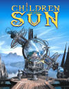
Children of the Sun |
Children of the Sun was an attempt, much like Earthdawn, to put a different spin on traditional fantasy themes, creating something different, yet not entirely alien. In our case, we have been exploring the theme of "dieselpunk", a dirtier, more modern steampunk. |


