| 2002 | 2003 | 2004 | 2005 | 2006 | 2007 | 2008 | 2009 | 2010 | 2011 | 2012 | 2013 | 2014 | 2015 | 2016 | 2017 | 2018 |
Best Production
This Sub-Award is dear to my heart: It goes to the designer who makes not only excellent games of rules and settings, but makes excellent games that are imminently readable and catchy to the eye. It could be through primarily layout and desktop publishing skills, followed by the use of art (not necessarily the best art, just art used to maximize the effect of the layout), innovative or creative new methods of game layout, clarity and readability of the text, materials used in the construction of the game, or, in the case of PDF games, the most effective use of all the features of PDF publishing. This award goes to the game or supplement that shows off the best "Mad Graphical Design and Layout Skillz".
The Finalists and Selected Peer Feedback
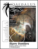
Daedalus
Daedalus strived for superior presentation and design of diverse content.
It had a unique look and feel that brought identity to the zine.
Daedalus is fantastic, a real treat for the eyes. The layout lets it be read easily, and it draws the reader in to ever page. Production of this caliber is rare in books you have to pay for; it's absolutely unheard-of in free stuff. Daedalus just plain rocks.

Daemon Codex
High quality softcover with simply some of the best artwork of 2003
- the Demons in there look awesome.
Daemon Codex is filled with text. In fact, I think there's more text in this book than most rpg books. As such, the art in the book had to be picked and placed for maximum effect. I found the book easy to read and containing art that was both good for the book and well placed within the book.
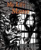
My Life With Master
From the size, to the use of whitespace and art layout, My Life With
Master is very engaging and easy on the eyes. It has the feel of a
Lemony Snickett book.
MLWM's eerie illustrations go a long way to reinforce Paul Czege's vision for the game. The small book is well laid out with a nicely spaced font and clear headings. An all round great product.

Orbit
Colour and style go a long way. Orbit looked the part.
Time and time again I have read that Orbit's art speaks to players and that part of learning how to get into character and play the game is found in the look of the book and its art.
Love the art! Pure underground fun with no holds barred.
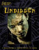
Unbidden
Unbidden is gorgeous, and beautifully laid out.
This book is one of the slickest titles I've seen come from the small press world in a loooong time. It's production values rival those of White Wolf.
Unbidden is simply a beautifully laid out PDF, with alternate layouts for printing purposes.

vs Monsters
Phil has a way with graphics. His layout for vs Monsters is simply
gorgeous, setting the bar higher for indie designers.
Phil Reed is the master of distressed and evocative layout. With the page design and layout of vs. Monsters we see him working very much in the sweet spot of what he does best.
It looks cool in a way that almost no rpg products do; it evokes trends in design out in the wider world. It's stylish, beautiful, and always thoroughly legible.
The Runners Up
| 3rd Place, with 24 Points |
UNBIDDEN |
| 2nd Place, with 29 Points |
vs MONSTERS |
And the Winner, with 32 Points, is...
 |
My Life With Master It's just so unique and it's a game that more people should play. Czege goes right off the RPG beaten path with this one, but he never loses sight of what role-play games are about --having fun. |
Further Feedback:
Daedalus
Daedalus was just a beautiful, beautiful magazine, well-layed out
and easy to read. It's a shame it had to die.
My Life With Master
Simple, straightforward, classy.
This stylish game is a pleasure to peruse, and reeks of the eerie gothic period of the setting.
MLwM has the most gorgeous character sheet in any game, ever. The art is used sparingly, but is very evocative. The use of white space and the clean layout is beautiful. Bravo for not filling every space.
Good things come in small packages
Orbit
I know the man who produced it. I know the man who did the layout.
I know the level of detail and excruciating care that went into it.
No one else could possibly have been that exacting.
Unbidden
I have seen it on RPGnow. Cool cover.
Nice bang for the buck.
vs Monsters
Just look at it.
This system is lite and fun. Its a little dark but its easy to learn and even easier to play. Phil Reed brings the story and rules across in a consistent and uniquely personal manner.
Nice icky feel to it.