| 2002 | 2003 | 2004 | 2005 | 2006 | 2007 | 2008 | 2009 | 2010 | 2011 | 2012 | 2013 | 2014 | 2015 | 2016 | 2017 | 2018 |
BEST PRODUCTION, 2008
This Sub-Award is dear to my heart: It goes to the designer who makes not only excellent games of rules and settings, but makes excellent games that are imminently readable and catchy to the eye. It could be through primarily layout and desktop publishing skills, followed by the use of art (not necessarily the best art, just art used to maximize the effect of the layout), innovative or creative new methods of game layout, clarity and readability of the text, materials used in the construction of the game, or, in the case of PDF games, the most effective use of all the features of PDF publishing. This award goes to the game or supplement that shows off the best "Mad Graphical Design and Layout Skillz".
THE BEST PRODUCTION FOR 2008 IS...
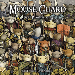
Mouse Guard by Luke Crane and David Petersen / with 64 points

Superb full-color hardback book, with great art, solid editing and clear writing. A coffee-table book that is also a manual. Wow.
Nearly perfect; a triumph of the form in all ways.
Hard to argue.
No one else is coming close to making books as pretty as Luke and his crew make them.
Gorgeous art. Beautiful layout. Well-crafted, precise text. A dust jacket that doubles as a map! Above and beyond the call of duty.
Beautiful.
THE RUNNERS UP:
3:16 Carnage Among the Stars by Gregor Hutton / with 22 points
Great cover and contrasting but equally exciting interior art.
An arresting cover and interior work that perfectly conveys the gritty, yet satirical world of the game. This one's the complete package.
Landscape format put to great use with a snappy cover and clear presentation. Stylish and easy to use.
Proof that black and white is no handicap to a designer with a sensibility to convey.
Hot War by Malcolm Craig / with 17 points
The images of devastation and despair were excellent, the posters conveyed both mood and information, and the background art and layout were also quite well done.
Hellas: Worlds of Sun and Stone by Mike Fiegel and Jerry D. Grayson / with 15 points
Slick, retro-80s art direction perfectly invokes the game's feel.
A beautiful envisioning of Greek myth come together with science fiction. The art is the game.
Starblazer Adventures by Chris Birch and Stuart Newman / with 12 points
Starting with a giant starship rising off into the heavens, the comic art infuses this with flavor.
Desolation by Jamie Gooch, Stephen Herron, and Matt Somers / with 10 points
Houses of the Blooded by John Wick / with 9 points
Storn and Daniel did the heavy lifting to make Houses look even better than it is.
Not only a beautifully layed out book, but also a CD of music serves to invite us into the lost world of the ancient Ven.
Sweet Agatha by Kevin Allen Jr. / with 9 points
Just stunning use of photography. A very mature piece of production. It's art.
Full-color magazine style production. Glossy, sexy, interactive and on a budget. Amazing.
Alpha Omega by David Carter and Earl Fischl / with 8 points
Serial Homicide Unit by Kat Miller and Michael S. Miller / with 8 points
Michael and Kat have done something new here and whether it worked or not, we will be looking at this game in the coming years very closely to figure out how to take this idea of an audio game and make it for our own purposes.